Fly Fish Rockport Website Redesign
The goal of this redesign was to modernize the site, improve content hierarchy, and create a clearer path for visitors to learn about the service and book a trip.
Project Case Study
Role
UX/UI Designer
Tools
Photoshop
Project Type
Website Redesign Case Study
The Problem
The original website had several usability and design issues that made it difficult for users to quickly understand the service or take action.
Key issues included:
Outdated layout that felt visually cluttered and inconsistent
Weak visual hierarchy, making it hard to scan information
Limited use of imagery, reducing emotional connection with the experience
Unclear booking path, requiring users to search for how to schedule a trip
Inconsistent spacing and alignment, which reduced overall readability
These issues made the site feel less trustworthy and less engaging for potential customers.
The Solution
The redesign focused on improving both the visual experience and the user journey.
Key goals included:
Create a modern, visually engaging homepage
Highlight the experience of fly fishing in Rockport through stronger imagery
Improve information hierarchy and readability
Add clear calls-to-action for booking trips
Organize content into logical sections users can quickly scan
UX Strategy
The redesign focused on creating a clearer user journey that helps visitors quickly understand the service and move toward booking a fishing trip. By improving visual hierarchy, organizing content into logical sections, and highlighting the fishing experience through imagery, the site becomes easier to navigate and more engaging for potential customers.
Key Goals:
Clarify the User Journey – Make it easier for visitors to understand what Fly Fish Rockport offers and how to book a guided fishing trip.
Improve Content Hierarchy – Organize information into structured sections so users can quickly scan and find important details.
Highlight the Experience – Use stronger imagery and visual sections to showcase the fishing environment, successful catches, and the expertise of the captains.
Hero Section Redesign
The original hero section used a background image and logo but did not clearly communicate the purpose of the website or guide users toward taking action. Visitors had to scroll before understanding the service or how to begin booking a trip. The redesigned hero section introduces a clear headline, supporting text, and a prominent call-to-action that immediately explains the experience offered by Fly Fish Rockport. By pairing strong imagery with focused messaging, the updated design improves clarity, strengthens visual hierarchy, and creates a more direct path for users to begin booking a guided fishing trip.
Key Improvements
Added a clear headline that immediately explains the service
Introduced supporting text to provide context for the experience
Added a prominent call-to-action for quick booking
Improved visual hierarchy with centered content and stronger contrast
Used full-width imagery to better highlight the fishing experience
Created a clearer path for users to take action upon landing on the page
Original Hero Section
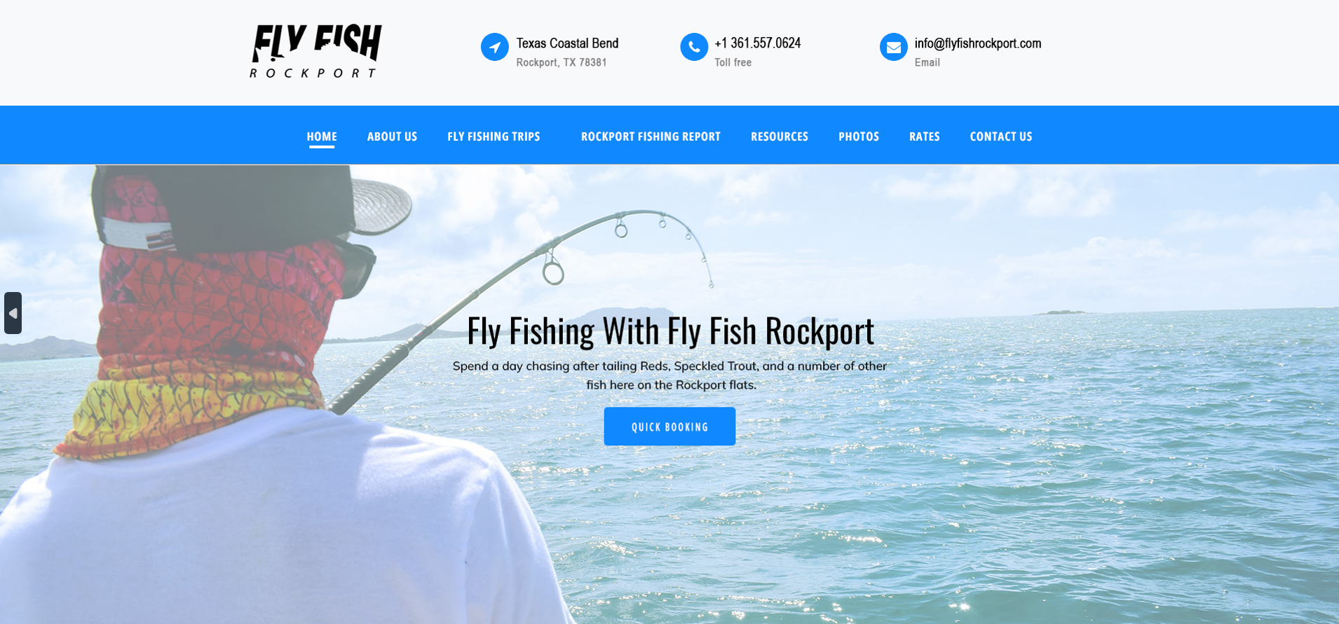
Redesigned Hero Section
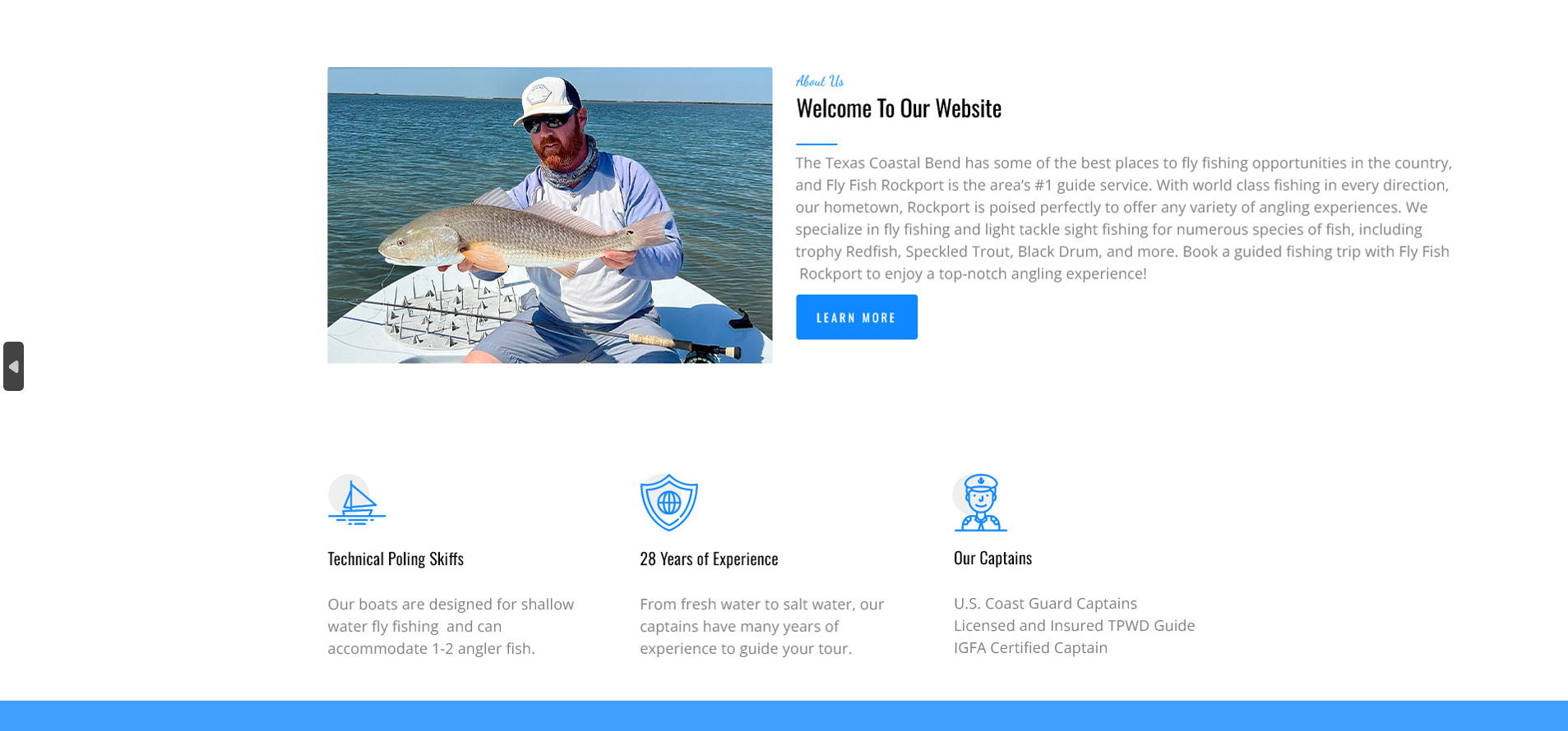
Welcome / About Section
The original welcome section provided introductory information about Fly Fish Rockport, but the layout made the content feel dense and visually disconnected from the rest of the page. The redesigned section improves readability by pairing the introductory text with a supporting image and organizing the content into a more balanced layout. This creates a clearer introduction to the service while helping users quickly understand what makes the guided fishing experience unique.
Key Improvements
Balanced layout with text and imagery
Improved spacing and alignment for better readability
Clearer introduction to the fishing experience
Stronger visual connection between content and imagery
Better content hierarchy to guide users into the rest of the page
Original Welcome / About Section
Redesigned Welcome / About Section
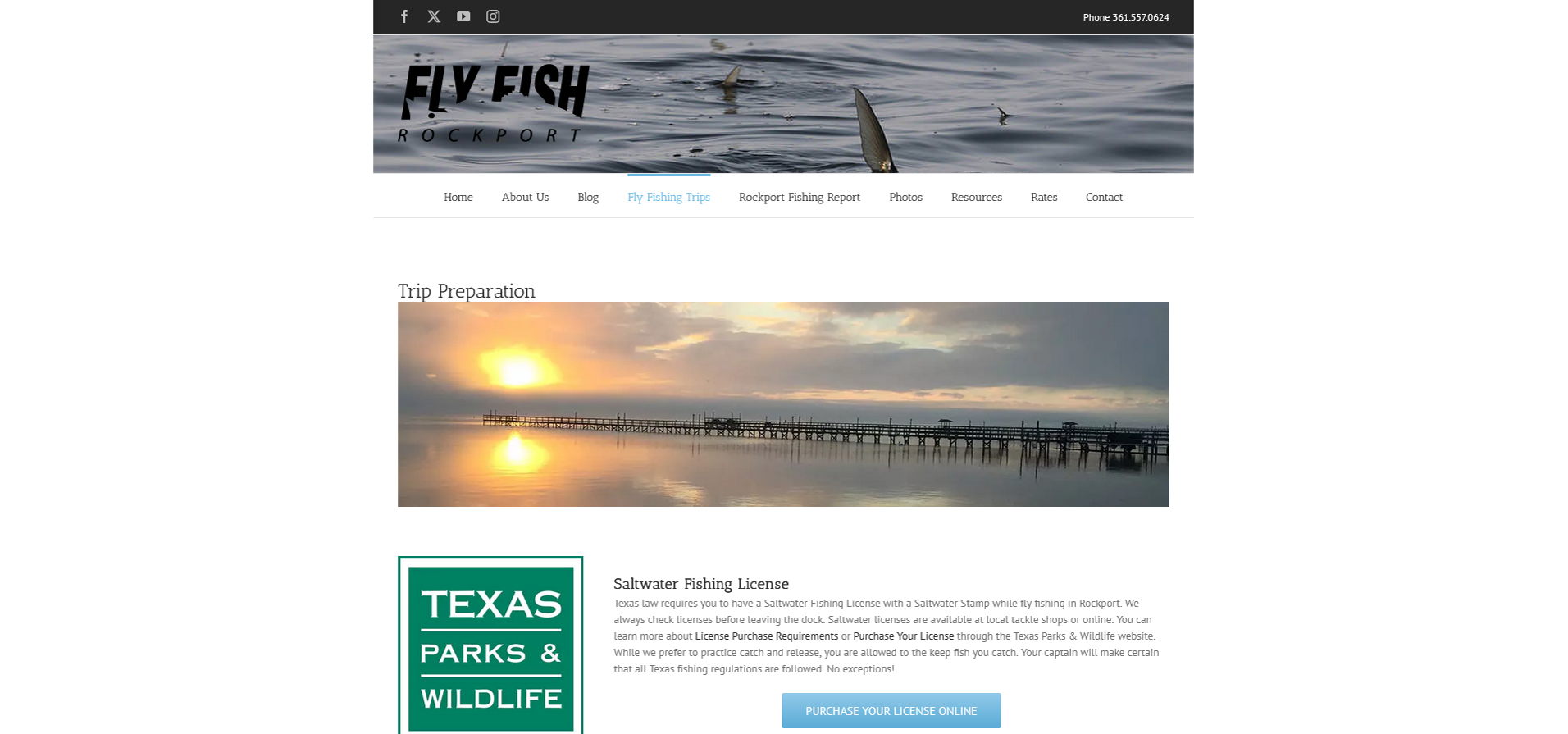
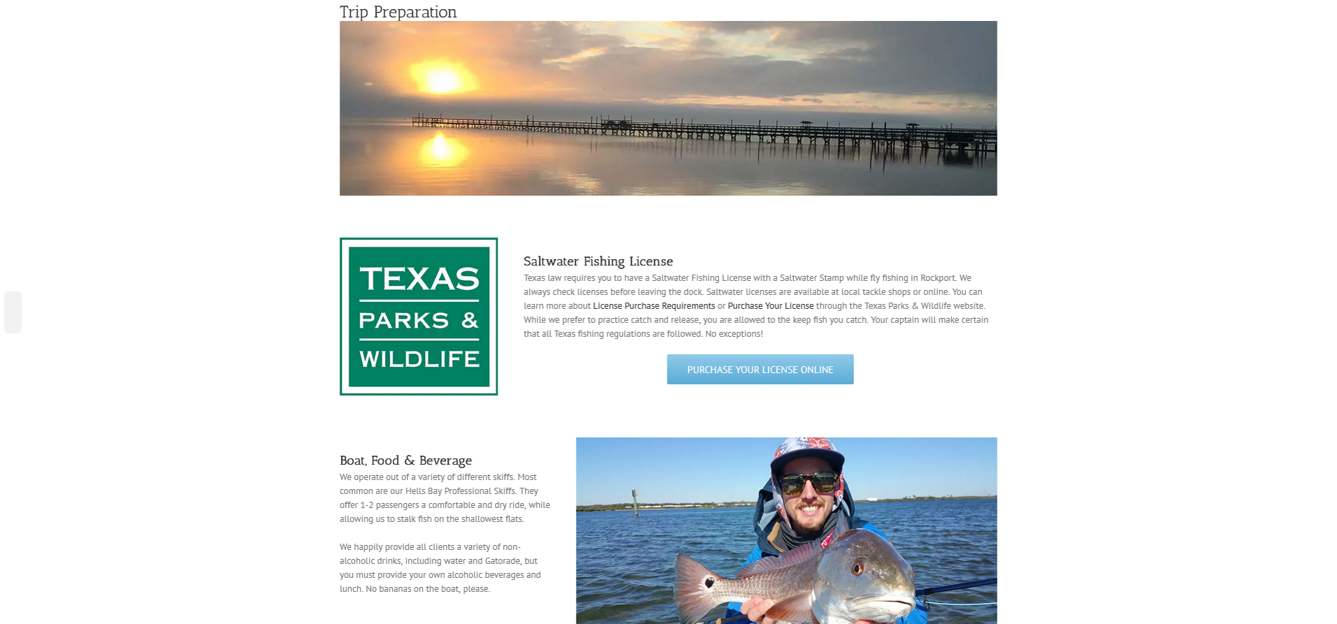
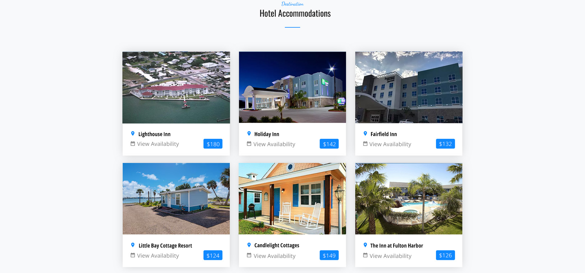
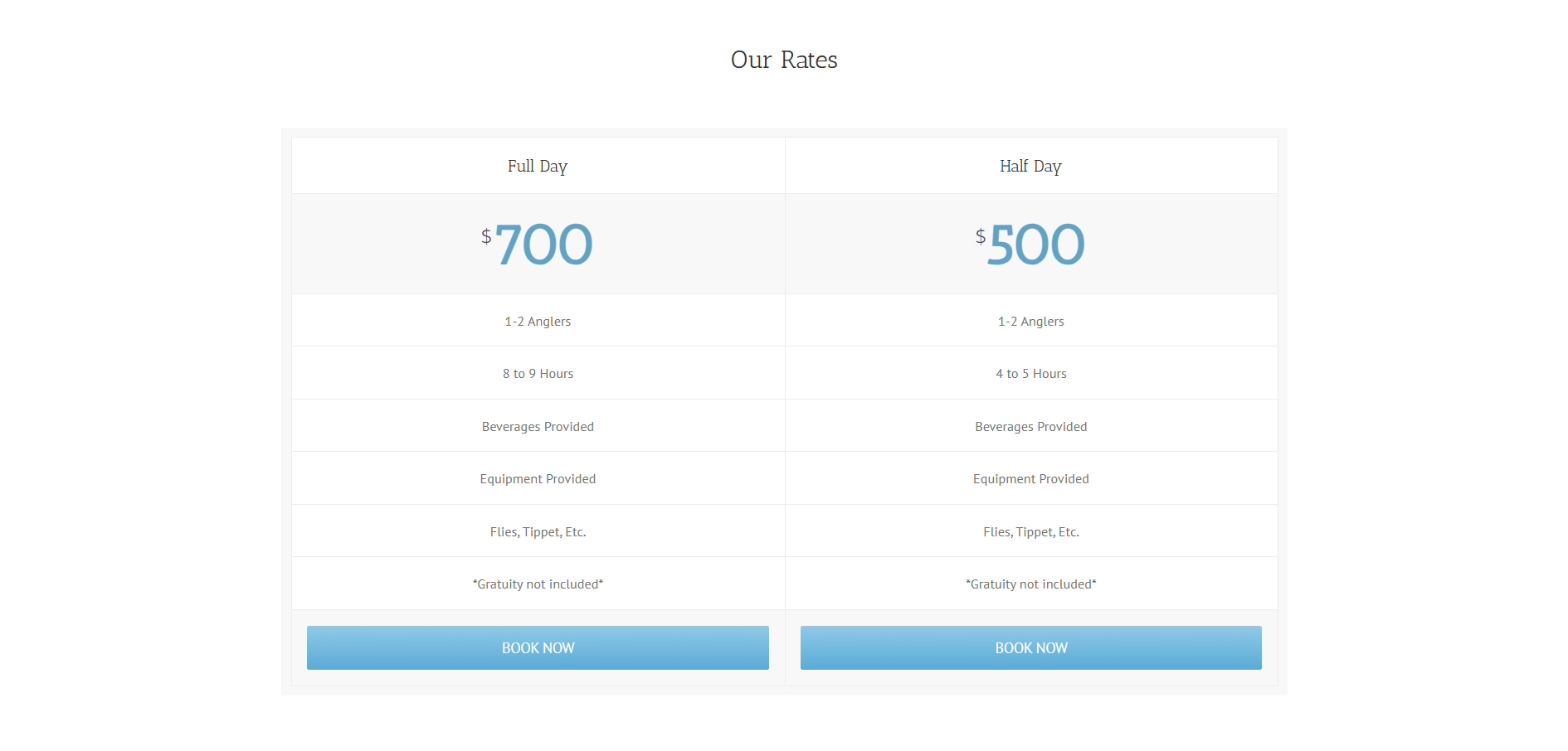
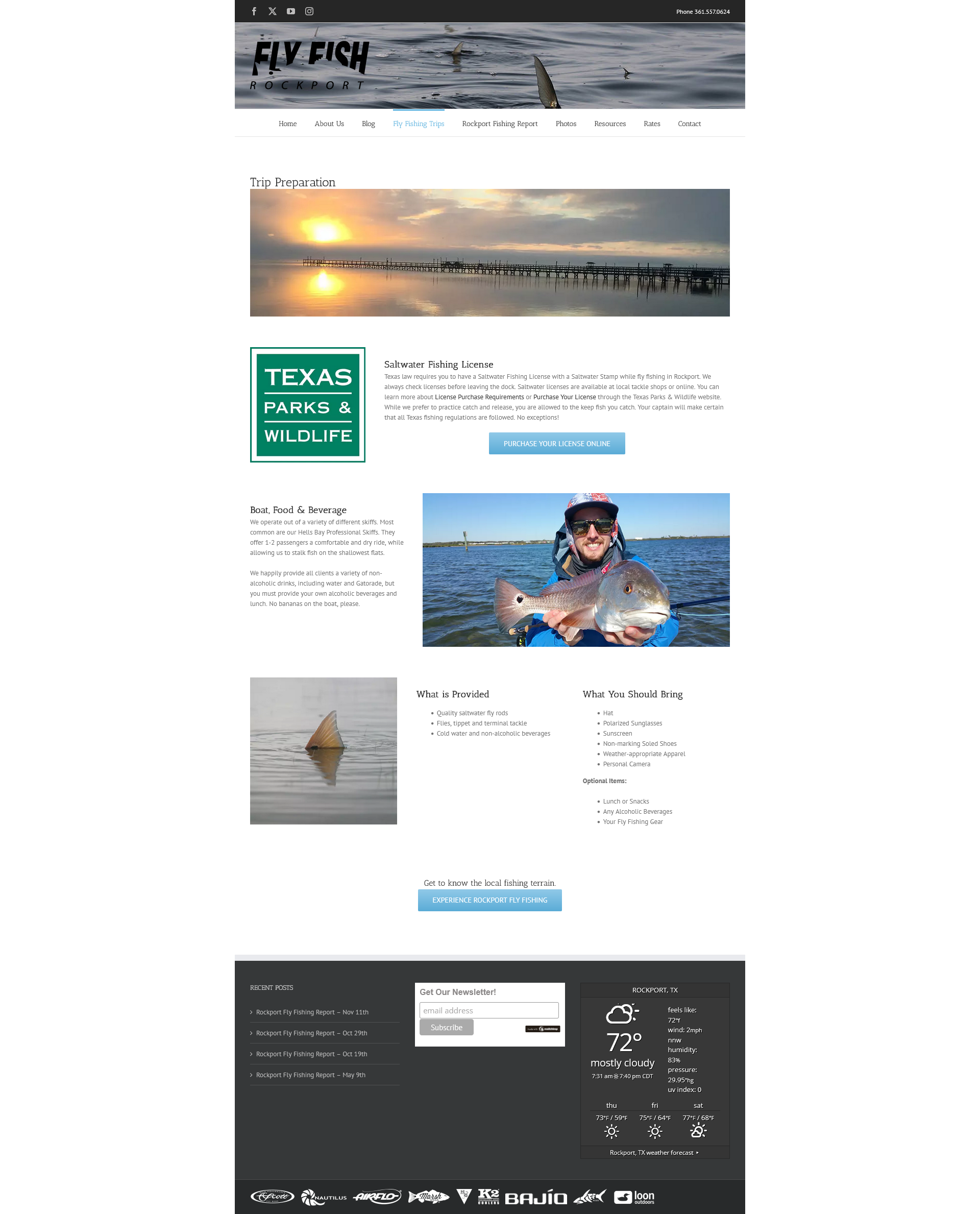
Trip Accommodation / Information Section
The original trip preparation section presented important information in large text blocks that were difficult to scan. Details about licensing requirements, boat information, and trip preparation were separated across multiple sections, making it harder for visitors to quickly understand what they needed before their trip. The redesigned layout organizes this information into clearer sections with improved spacing, supporting imagery, and more structured content. This helps visitors quickly find key details and better prepare for their guided fishing experience.
Key Improvements
Organized preparation information into clearer sections
Improved readability by breaking up large text blocks
Used supporting imagery to create visual balance
Structured content so visitors can quickly find what they need
Reduced cognitive load by presenting information in a more scannable format
Original Information Layout
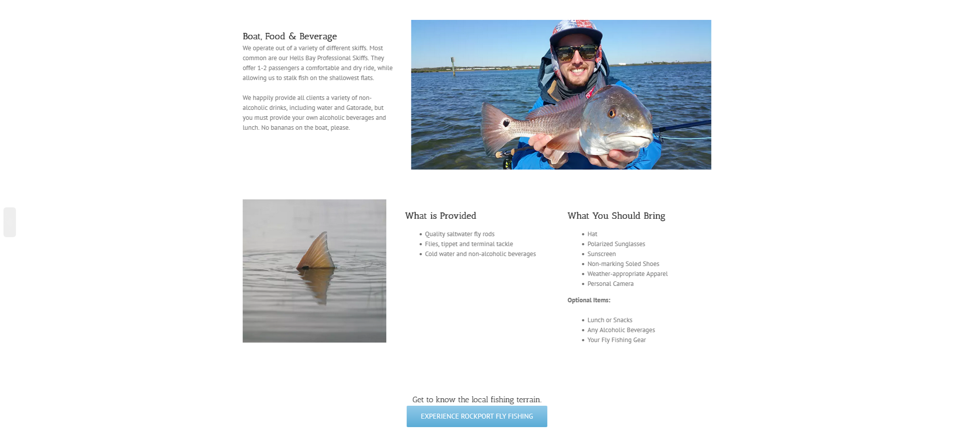
Structured Accommodation Listings
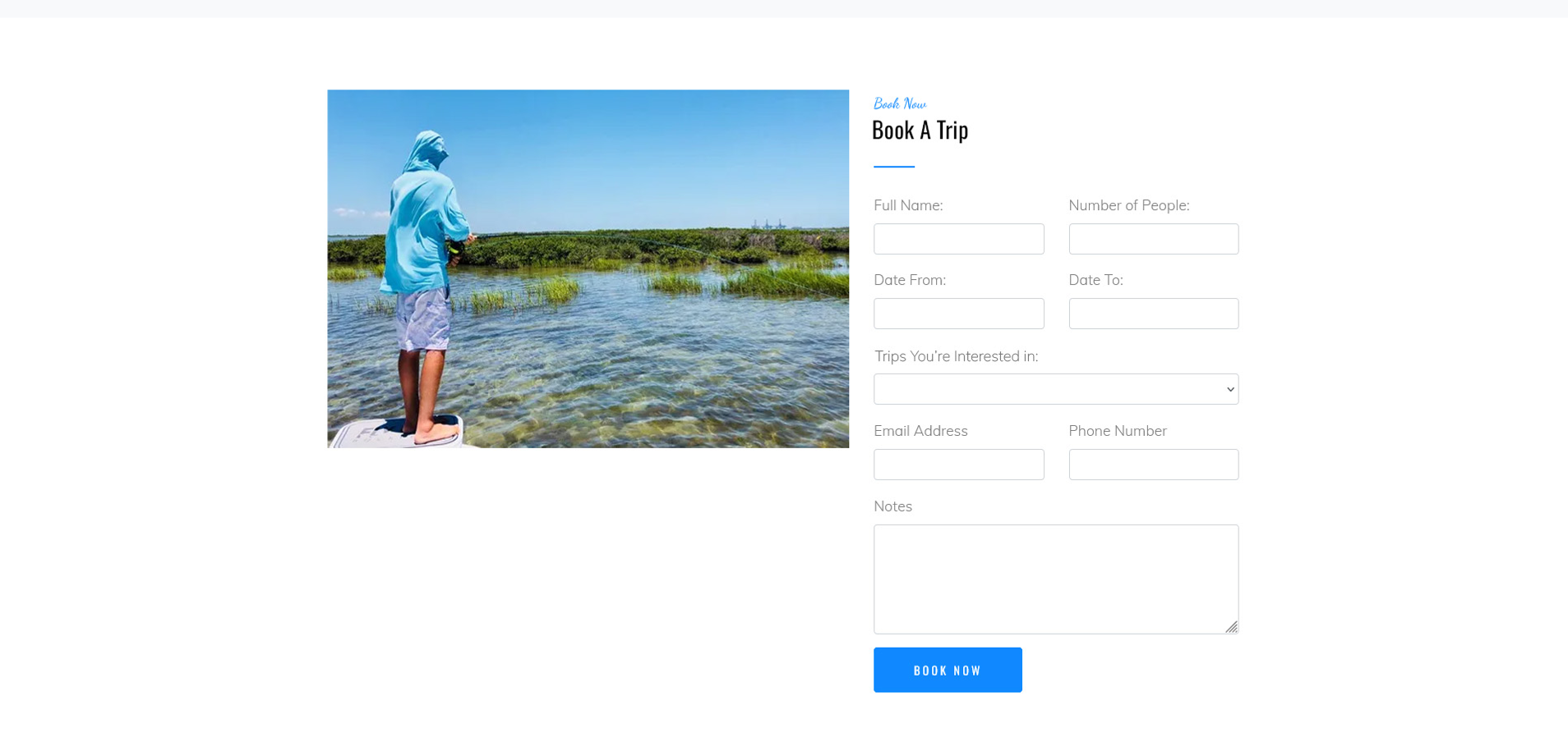
Booking Section
The original website did not provide a clear or immediate way for visitors to schedule a fishing trip. Users had to search through the site to find booking information, which created unnecessary friction in the process. The redesigned booking section introduces a dedicated form directly on the page, making it easier for visitors to quickly submit trip details and reserve their experience. By pairing the booking form with strong visuals and a clear call-to-action, the new design creates a more direct and user-friendly path for scheduling a guided fishing trip.
Key Improvements
Introduced a dedicated booking form directly on the page
Reduced friction by allowing users to schedule trips quickly
Added clear form fields for trip details and contact information
Created a stronger call-to-action for reservations
Positioned the booking section where users are ready to take action
Original Booking Section
Redesigned Booking Section
Results
The redesigned Fly Fish Rockport website improves both usability and visual presentation, creating a clearer and more engaging experience for visitors. By strengthening visual hierarchy, organizing content into structured sections, and introducing a dedicated booking form, the site now guides users more naturally from learning about the service to scheduling a trip.
The updated design highlights the fishing experience through stronger imagery while making important information easier to find. These improvements help reduce friction in the booking process and present the guide service in a more modern and professional way.
Key Outcomes
• Clearer user journey from landing on the site to booking a trip
• Improved content hierarchy and readability
• Stronger visual storytelling through imagery
• Reduced friction in the booking process
• More professional and engaging presentation of the service
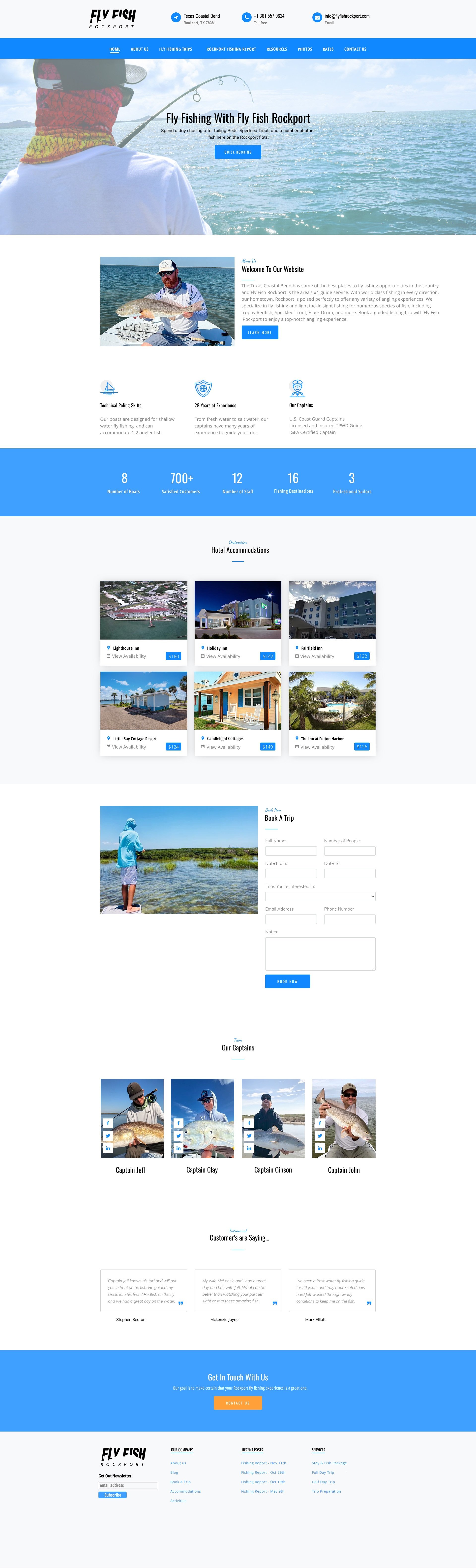
Original Homepage