ATC Website Redesign
Modern redesign focused on improving usability, visual hierarchy, and lead generation for a local HVAC company.
Project Case Study
Role
UX/UI Designer
Tools
Photoshop
Project Type
Website Redesign Case Study
The Problem
The original ATC website felt cluttered and visually overwhelming. Multiple banners, competing calls-to-action, and inconsistent spacing made it difficult for users to quickly understand the company’s services or locate important information.
The navigation and page structure also made it harder for potential customers to request a quote.
Key Issues
• Overcrowded layout with competing elements
• Multiple calls-to-action without a clear priority
• Promotional banners distracting from core services
• Inconsistent spacing and typography
• Weak visual hierarchy and content organization
• Outdated design that did not reflect a modern HVAC brand
The Solution
The redesign focused on creating a clean, modern layout that clearly communicates ATC’s services while guiding visitors toward contacting the company.
The homepage was simplified and reorganized into structured sections with improved typography, stronger hierarchy, and more intentional use of color.
Key Improvements
• Simplified hero section with clear messaging
• Strong primary call-to-action
• Structured service cards for easier scanning
• Trust signals such as statistics and testimonials
• Streamlined quote form to support lead generation
UX Strategy
Before redesigning the interface, the primary focus was understanding how users would interact with the site and what information they needed most.
The redesign prioritizes three key user goals:
• Quickly understand what services the company provides
• Easily locate HVAC service options
• Contact the company to request a quote or service appointment
To support these goals, the redesigned homepage focuses on clear messaging, structured content sections, and strategically placed calls-to-action that guide users through the page.
Hero Section Redesign
The hero section was redesigned to simplify the homepage, improve visual hierarchy, and guide users toward the most important action—contacting the company for service. The original hero area contained multiple promotional banners and competing messages, making it difficult for users to quickly understand what the company offers. The redesigned hero focuses on clear messaging, stronger hierarchy, and a more modern layout that immediately communicates the company's services.
Key Improvements
Simplified Messaging
The original hero included several promotional banners and badges that competed for attention. The redesign removes unnecessary elements and focuses on a clear headline that communicates the company's primary service.
Improved Visual Hierarchy
Typography, spacing, and layout were adjusted to guide the user's eye from the headline to supporting information and the call-to-action.
Clear Primary Call-to-Action
The redesigned hero introduces a prominent contact button that encourages users to request service or a quote immediately.
Cleaner Layout
The layout was restructured to reduce clutter and create better spacing between elements, making the hero section easier to scan and understand.
Original Hero Section
Redesigned Hero Section
Service Section Redesign
The original homepage relied heavily on promotional banners that made it difficult for users to quickly identify ATC’s core services. The redesign organizes services into structured cards that make the content easier to scan and understand.
Key Improvements
• Organized service categories
• Consistent iconography
• Clear descriptions
Original Services Section
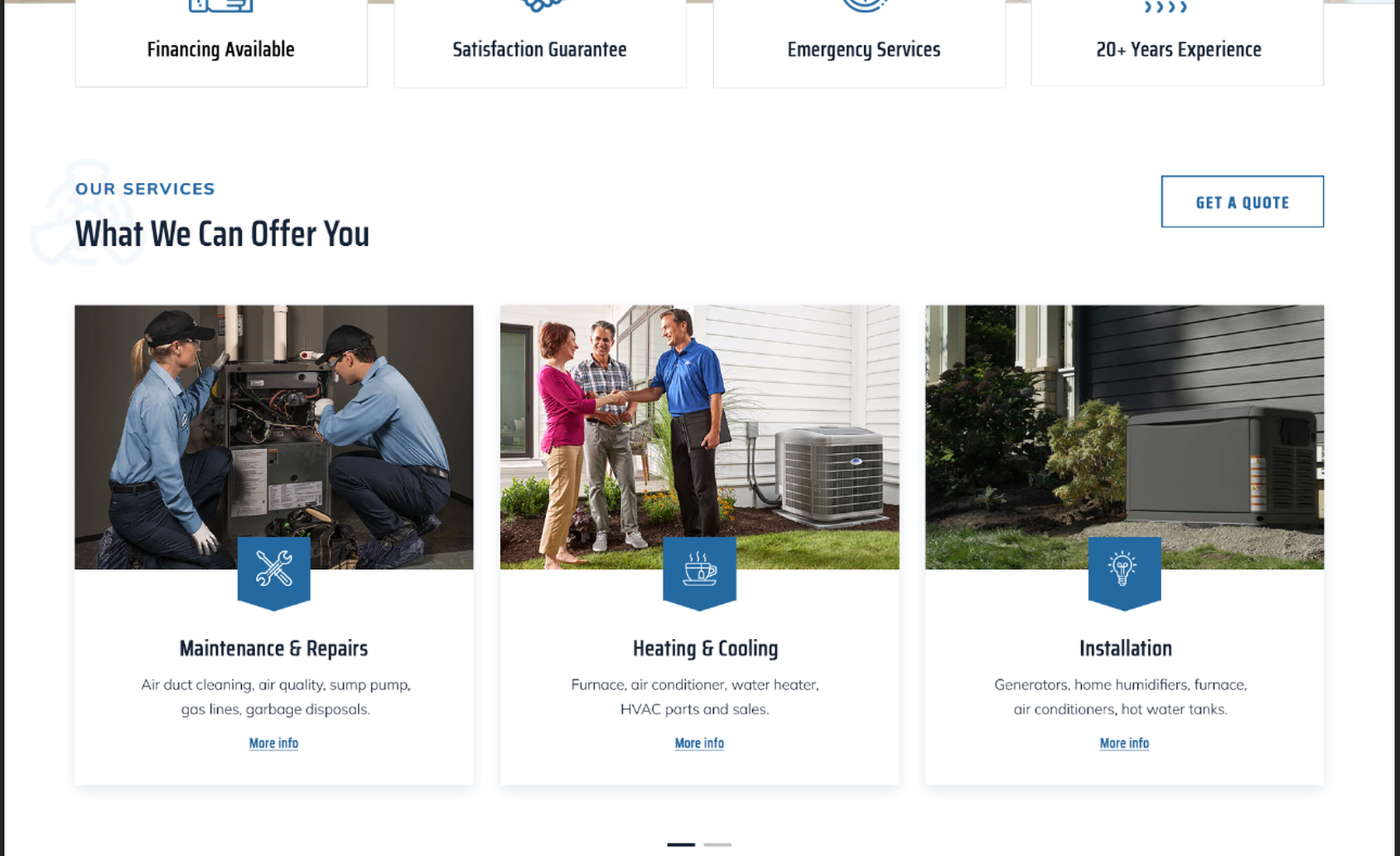
Redesigned Services Section
Service businesses rely on trust and credibility. The redesigned website highlights company experience and customer satisfaction through visual statistics and structured content.
This helps reassure potential customers and reinforces ATC’s professionalism.
Customer Satisfaction Section
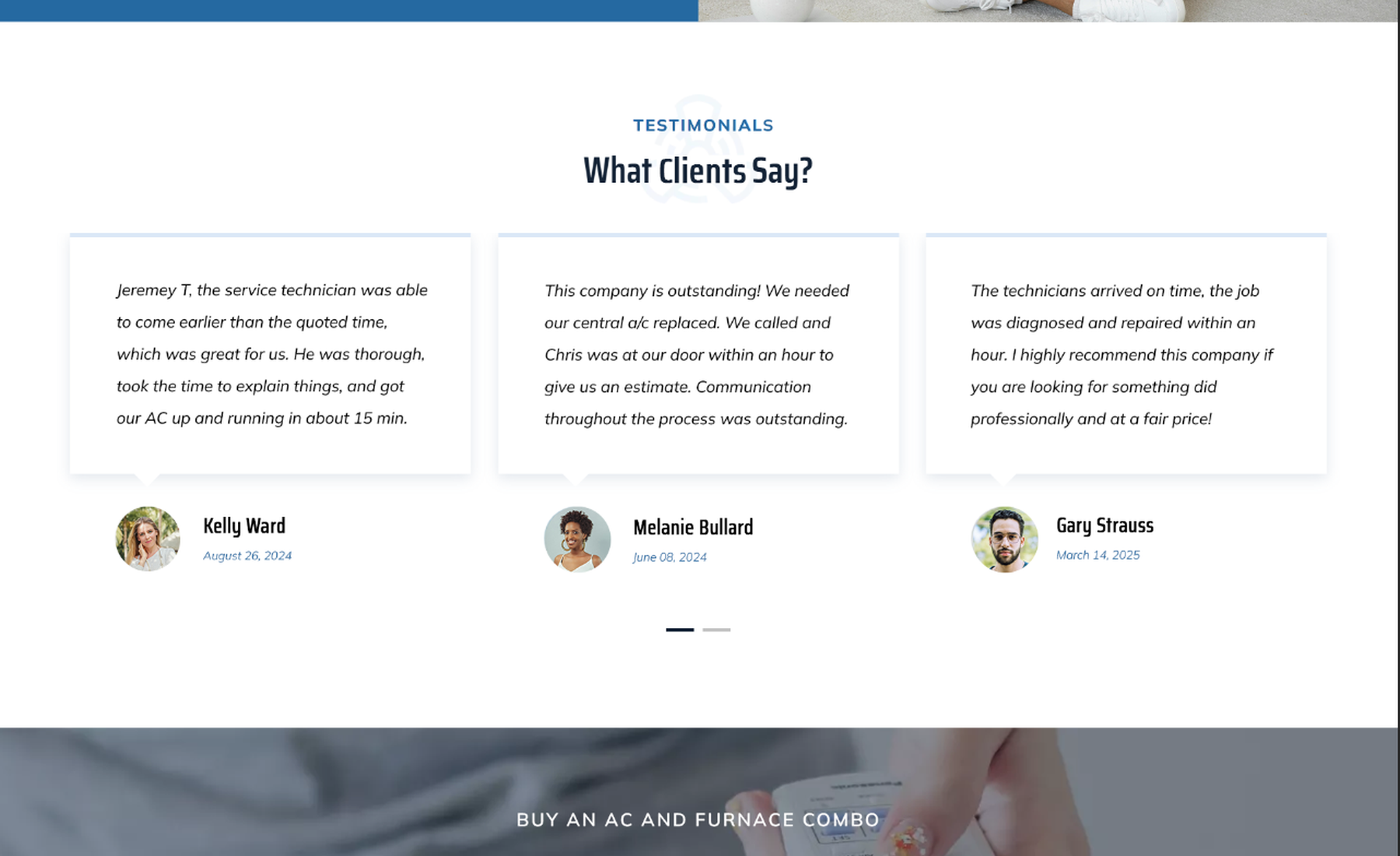
Testimonials Section
Lead Generation Section
The original website placed its contact form within a crowded layout. The redesign simplifies the form and places it within a clean section that encourages visitors to request a quote.
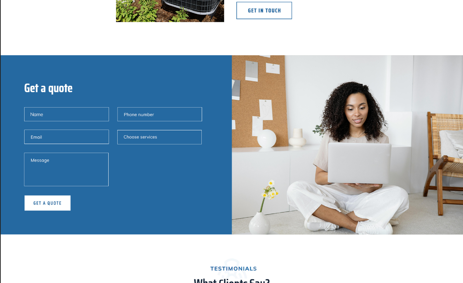
Contact Form
Project Outcome
The redesigned website improves clarity, visual hierarchy, and usability, allowing visitors to quickly understand the company's services and contact the business for HVAC support.
Visitors can now easily understand the company’s services and quickly take action.
Key improvements include:
• Modern visual design
• Improved user experience
• Clear service organization
• Stronger trust signals
• Better lead generation
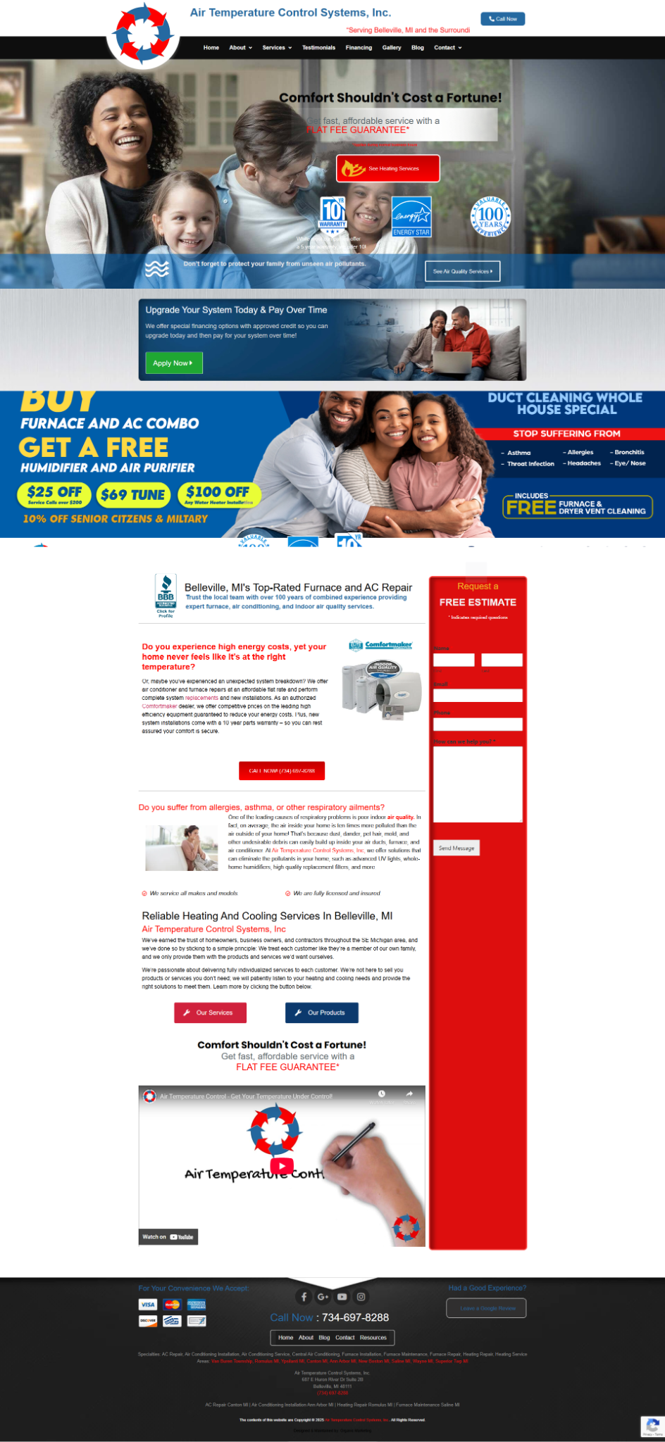
Original Website